Backme is an independent crowdfunding cash flow system and also a powerful pre-order tools. Users can create crowdfunding campaigns and create crowdfunding rewards on the admin panel. Project-creators can manage their campaign, backers’ data, and transaction records on the admin panel. It is important to present data clearly and quickly and accurately guiding users through complex business processes on the admin panel. I conducted user research and redesigned its admin panel based on their needs. Also, I designed and developed interfaces for new features, including writing feature tests.
Collaborators
Adele Yu, Ronald Hsu and Kelvin Lin
Role
I worked as a product designer and front-end developer and collaborated with project manager and back-end engineer.
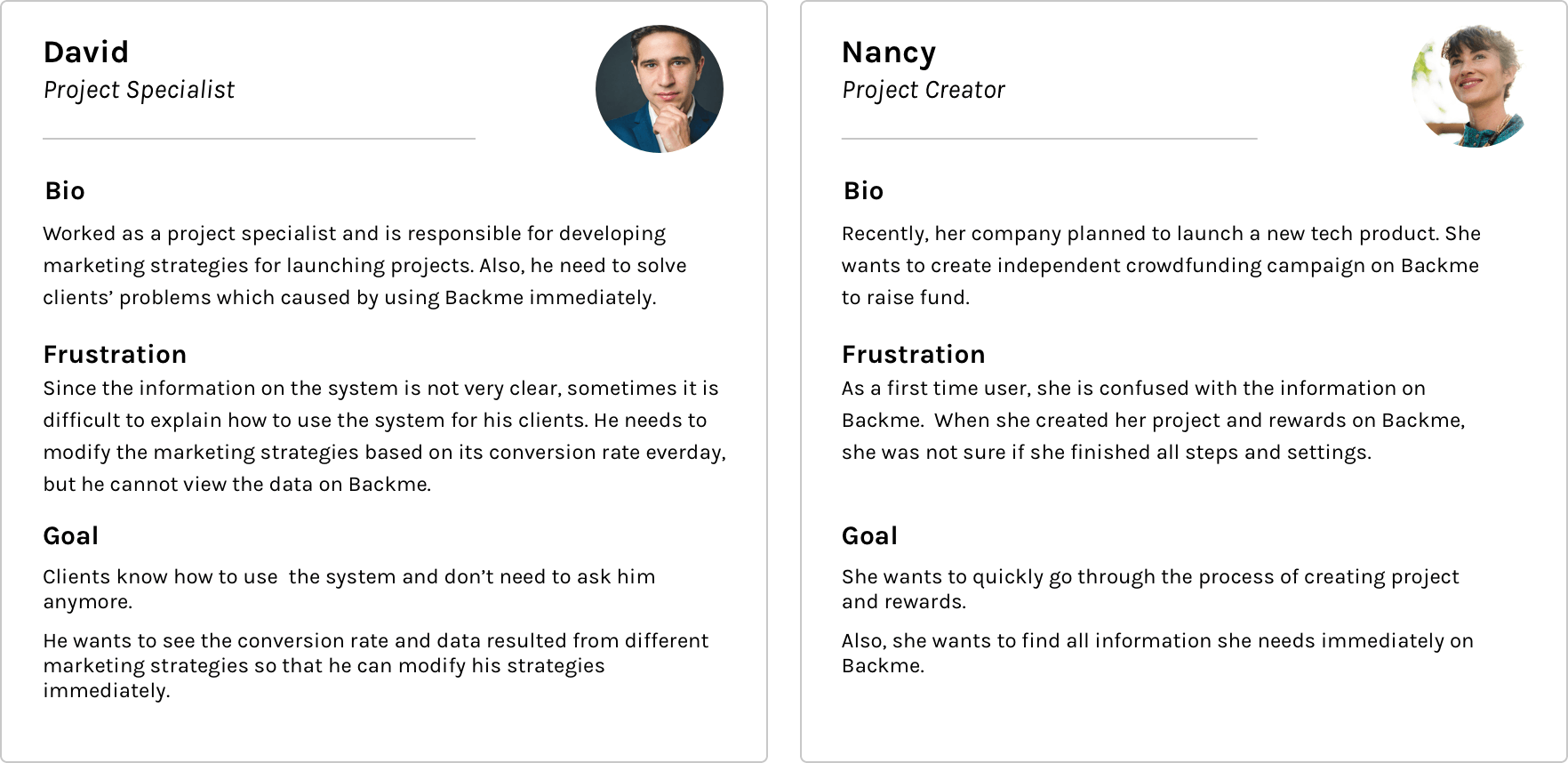
First of all, I conducted interviews with end users including project creators, engineers and project specialists who are responsible for developing marketing strategies for launching projects, to find out the problems they encountered when they used Backme. The result shows that:
Problems
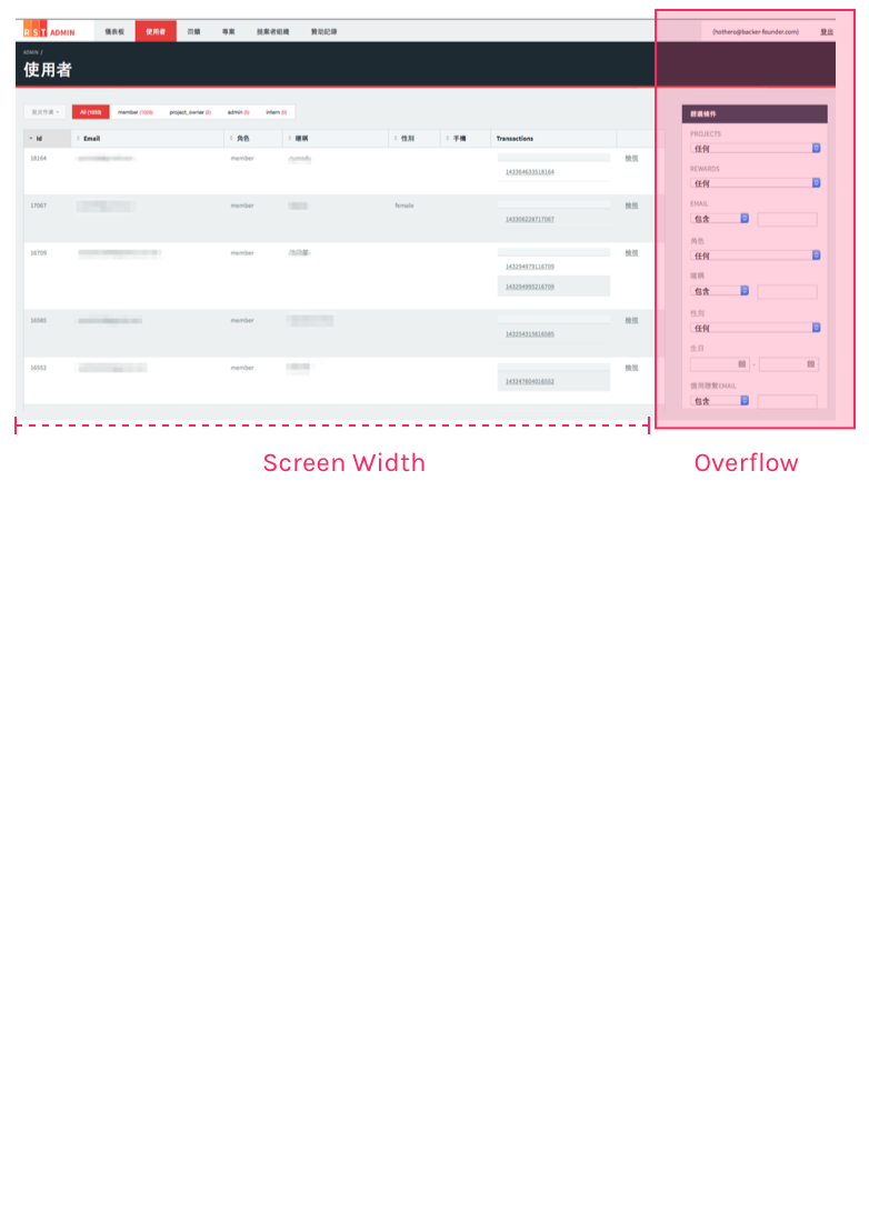
Users cannot easily find the search menu on the right side of the screen because the table on the left is too large and users should use a scrollbar to explore the whole interface.
Users can hardly find important information since there is no tags or labels in the interface.
Project specialists need to spend a lot of time explaining how to use the system for their clients.
There is no design guideline for the system and it is hard for engineers to develop the system.
The process of creating rewards also causes confusion for both project specialists and project creators.
The Email marketing system needs to be updated and also allow users to view the open rate and click rate.
Project Specialists wants to see the conversion rate and data resulted from different marketing strategies so that he can modify his strategies immediately.
Solution
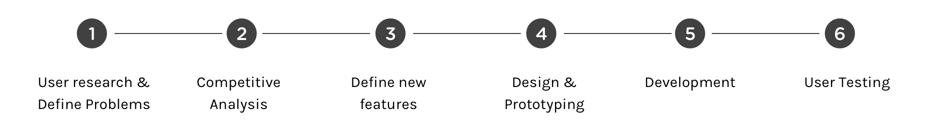
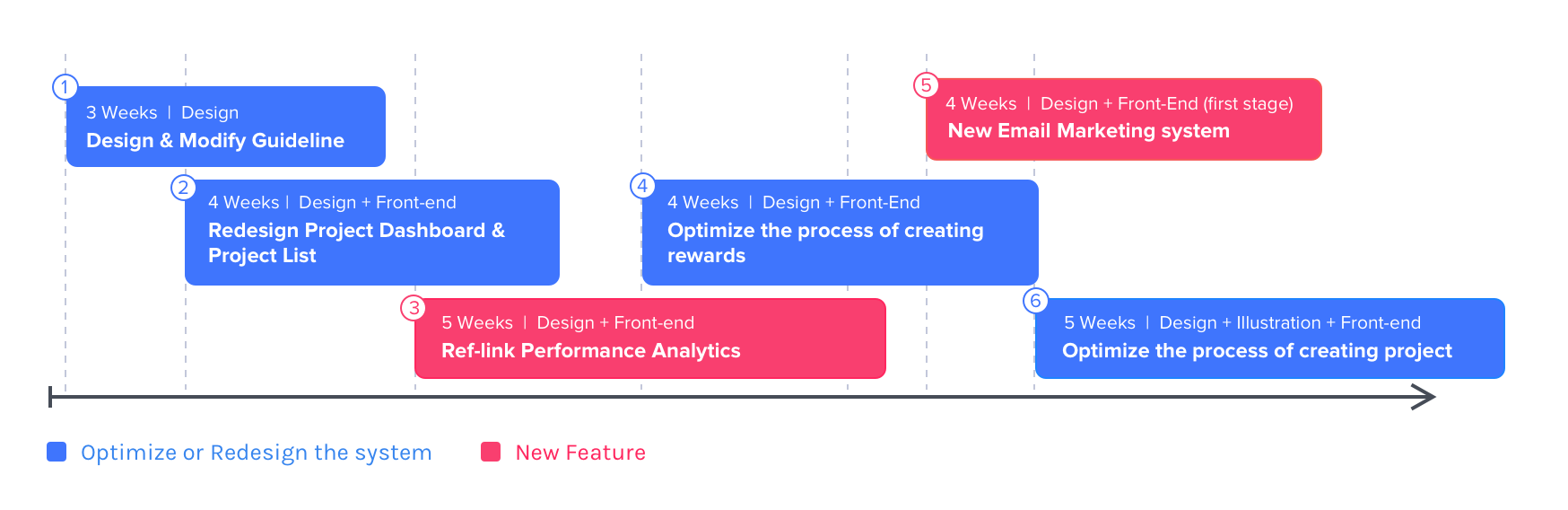
After interviewing end users, we defined the problems and seperate them into different tasks. The tasks can be categorized into “New Features” and “Optimize or Redesign the System”. I will introduce 2 tasks and their design.
Timeline & Tasks
Task 1 : Redesign Project List and Project Dashboard
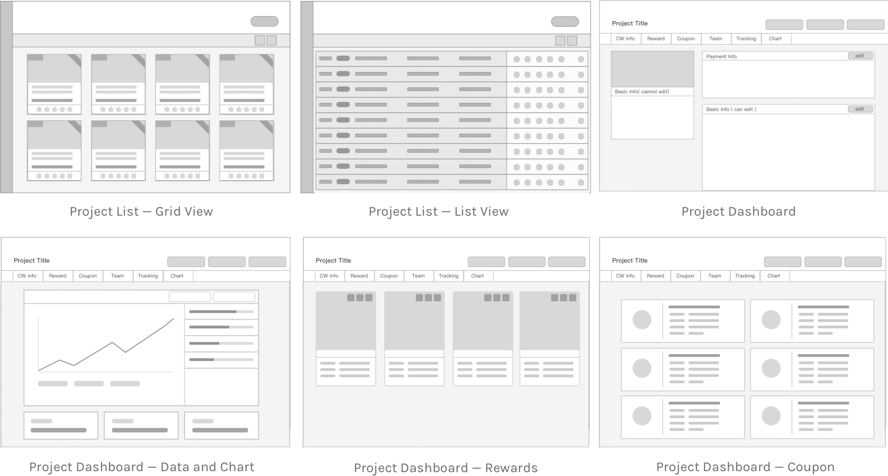
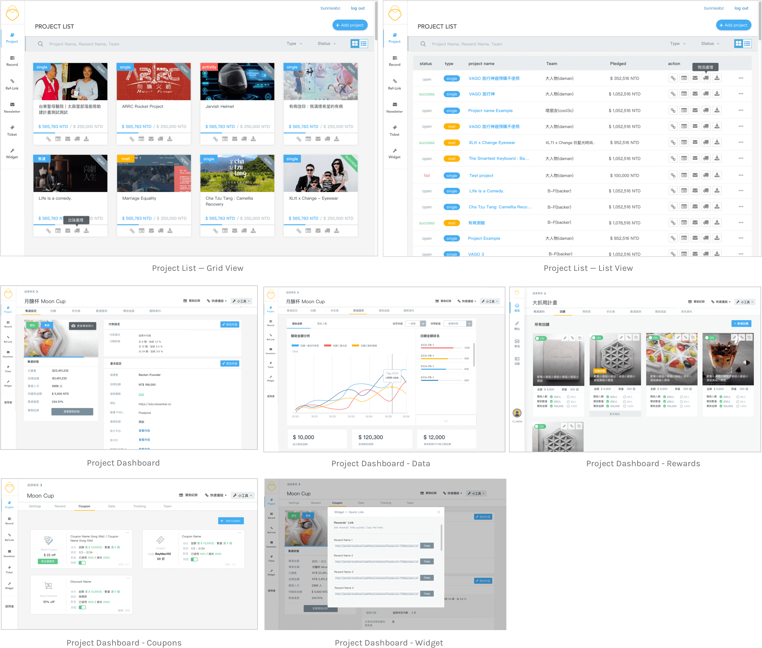
To solve the problem that the search bar was on the right side and was not easy to be found by users, I redesigned the project list. Users can choose to use “Grid View” which showcases photo and brief introduction of each project or “List View” which can display more projects in the limited space. Moreover, I added tags and labels on the list so that users can find out the project they want more quickly.
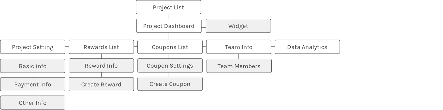
On the other hand, I reorganized the information architecture of Project Dashboard since many users cannot find out project information they need. I interviewed several end users to categorize the information and decide their order.
Information Architecture
Wireframes
I also created wireframes to discuss with engineers and project specialists to see if this design is feasible or not. Also, I could confirm if this design sove their problems or not.
High-Fidelity Prototype
Results
This design provides more clear information and intructions and reduces the costs of customer service. Also it reduces workload for project specialists since they can quickly find out information they need.
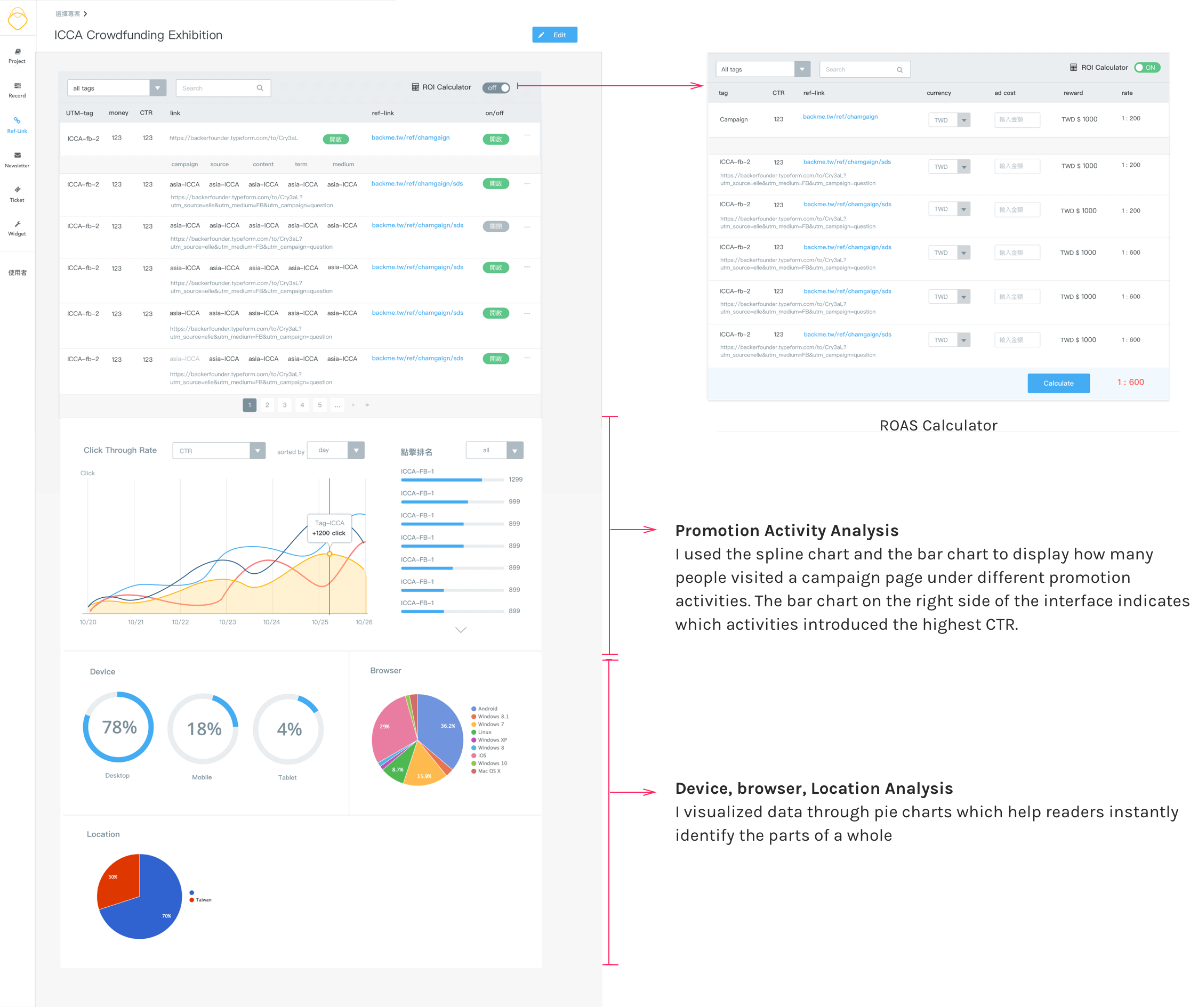
Task 2 : Referral URLs Analytics
For project specialists, they need to develop and modify marketing strategies based on conversion rate of advertisement everyday. They access the conversion rate by using UTM parameters which are simply tags you add to a URL — when your link is clicked, the tags are sent back to Google Analytics and tracked. However, they still need to calculate how much money each link makes. Moreover, they should view the data on Google Analytics and compare the conversion rate with the fund raised on Backme.
To solve the problem, we access the tracking data and connect it to Backme. I designed interfaces that condensed huge amounts of data into charts which users can easily explore Click Through Rate(CTR) and the money each promotion activity made. Also, I designed a Return On Advertising Spend (ROAS) calculator. After switching to calculator mode, users can key in each advertising cost and quickly get ROAS.
New Feature : Email Marketing System
Based on the research we did, we decide to create a better Email Marketing feature. It is a new feature designed for our project specialist to track if the recipients open the email, click on the call to action button in the email or not. Actually, the email marketing system’s already built, but the system is too old. Also, we planned to integrate this feature into Backme and combined with the data we had on Backme, so our users do not need to use another system and keep compare data between two systems.
Development
Several modern web development frameworks were implemented in this project, including Ruby on Rails, Bootstrap and CSS Sass. I mainly took charge of the front-end work (html, css, javascript, Vue.js, D3.js, Chart.js) and used GitHub to work with back-end developers. It was efficient to be both the designer and developer of the project because I had full control of the look of the end result. Involving in front-end and design work, allow me to think from both perspectives and consider more about the feasibility design.
Backme Guideline & Module
At first, there was a simple design guideline which provided colors, font styles and basic UI components. However, with the development of new features, we need to create more UI components to adopt to new needs. To make the styles of Backme more consistent, I design a more accurate, clear and reusable UI guideline and modules.